Real talk.
Built on a system.
How We Da People Network looks, sounds, and shows up — the logo, the color, the type, the voice, and the components that get used to build everything else. If you're producing merch, social, a partner spot, or a new page on the site, start here.
The blackletter W is the primary mark. It scales from a 16-pixel favicon to a hat patch. The wordmarks ride alongside it when context needs the full name.

Primary mark
The solid W. Use this whenever a single icon needs to read as the brand.
On paper
Approved on light surfaces too. The mark is dark — never invert to red.
On accent
Acceptable for high-impact moments (merch, hero panels, posters).

Network wordmark
Used for the parent brand — the network that owns the podcasts, shows, and events.

Podcast wordmark
Red graffiti treatment. Lives on the podcast show page hero. Don't recolor.
Outline W
Embroidery / hat patch / background flourishes. Optional asset.
Clear space
Keep at least half the W's height of empty space on every side. No text, no other marks inside that buffer.
Minimum size
Don't render the mark below 24px on screen or 0.4 inches in print — the blackletter detail breaks down.
Red accent.
Eight tokens. The accent does the heavy lifting — it shows up on CTAs, active states, eyebrows, and selection. Everything else stays out of the way.
Ink
#0a0a0a
--color-ink
Primary background. Everything sits on this.
Paper
#fafafa
--color-paper
Primary text and high-contrast surfaces.
Bone
#f1ede6
--color-bone
Warm light tone for editorial moments.
Smoke
#1a1a1a
--color-smoke
Cards and elevated surfaces.
Ash
#2a2a2a
--color-ash
Secondary surfaces, borders, dividers.
Fog
#6b6b6b
--color-fog
Body copy, captions, less-emphasized text.
Accent
#b4131c
--color-accent
The brand red. Primary CTAs, hover states, badges.
Accent Hot
#e11d20
--color-accent-hot
Hover/active state for the accent.
One job each.
Anton carries the noise. Inter carries the meaning. JetBrains Mono carries the metadata. Don't introduce a fourth.
Display — Anton
All headings, hero copy, episode titles, big numbers. Use uppercase. Tight tracking. Tall.
font-family: "Anton", "Bebas Neue", "Impact", system-ui, sans-serif
Aa Bb 0123
The quick brown fox jumps over the lazy dog.
abcdefghijklmnopqrstuvwxyz · 0 1 2 3 4 5 6 7 8 9
Sans — Inter
Body copy, navigation, buttons. Default weight 500–600 for UI, 400 for long reads.
font-family: "Inter", system-ui, -apple-system, "Segoe UI", Roboto, sans-serif
Aa Bb 0123
The quick brown fox jumps over the lazy dog.
abcdefghijklmnopqrstuvwxyz · 0 1 2 3 4 5 6 7 8 9
Mono — JetBrains Mono
Durations, timestamps, code, metadata badges. Anywhere you want a fixed-width feel.
font-family: "JetBrains Mono", ui-monospace, SFMono-Regular, Menlo, monospace
Aa Bb 0123
The quick brown fox jumps over the lazy dog.
abcdefghijklmnopqrstuvwxyz · 0 1 2 3 4 5 6 7 8 9
Display scale
Display sizes use fluid clamp()
so they grow with the viewport. Pick by role, not exact pixels.
H1 — Page hero
H2 — Section / episode
H3 — Block
H4 — Card title
Eyebrow — Section labels & captions
We Da People Network — independent 2A media with the culture in mind. Podcasts, training, and grown conversations about guns, freedom, and responsibility.
Do
- ✓ Talk like a barbershop, not a press release. Direct, plainspoken, confident.
- ✓ Skip jargon unless you're explaining it. Define acronyms the first time they show up.
- ✓ Welcome new gun owners. Never condescend.
- ✓ Show the culture: Black-American 2A community, but inclusive. The crew is the perspective.
- ✓ Anti-LARP, pro-real-training. Reps, fundamentals, and gear that actually gets used.
- ✓ Lead with the question or the takeaway. Save the hedges for the body.
Don't
- ✕ Don't sound like a corporate brand. No "we are excited to announce."
- ✕ Don't talk down to beginners. Don't gatekeep with brand names or caliber wars.
- ✕ Don't preach. Don't moralize. Don't make every episode a politics episode.
- ✕ Don't bury the lede in qualifications.
- ✕ Don't use generic stock-image energy in titles ("A Comprehensive Guide to…").
Tone, side by side
Episode title
YES Bullpup vs AR-15: which setup makes more sense?
NO A Comprehensive Technical Analysis of Modular Rifle Platforms
Section header
YES Get at us.
NO Contact Us
Newsletter pitch
YES Episodes, events, merch, partner deals — pick your topics.
NO Subscribe to our newsletter for important updates.
Show description
YES Raw, unapologetic conversations at the intersection of culture, firearms, freedom, and real life.
NO A premier podcast dedicated to discussing topics related to firearms and freedom.
Buttons
Sharp corners (radius 0). Tracked-out caps. Accent button → accent-hot on hover. Outline button → accent border on hover. One CTA per surface.
Badges
Square chips. 10px bold + widest tracking + uppercase. Use accent for episode numbers, paper for bonus content, outline-on-glass for durations.
Section label
Numbered eyebrow + hairline + label. The frame that opens every page section. Numbers are zero-padded and run sequentially down the page.
Card
Eyebrow
Card title
Smoke surface, hairline border, accent border on hover.
Eyebrow
Card title
Use for episodes, contacts, affiliates — anything that links somewhere.
Eyebrow
Card title
Padding is generous — these are billboards, not list items.
A little grit.
Everything is square — radius 0. The grain texture is the only place the brand allows itself to be soft. Motion is short (120ms) and only used to telegraph state changes, never to decorate.
Grain
Subtle noise overlay on hero panels. Adds analog feel without competing with content.
Red bar
36×3px accent rule. Stamps sections that need extra weight. Use sparingly.
Motion
120ms ease on color/border/transform. Marquee on long lists. Respect prefers-reduced-motion.
Don't round corners
Every surface is square. Rounded corners break the system.
Don't squish the mark
Lock the aspect ratio. The W is drawn, not stretched.
Don't introduce new colors
The palette is final. No gradients, no rebrand-by-vibe.
Don't substitute the font
Display is Anton. Serif is never the brand.
Don't recolor the W
The mark stays white/dark. Red is reserved for accents around it.
Don't write press-release titles
Direct, punchy, conversational. Headlines, not abstracts.
partner posts, press.
Approved promo photos by show. Use these for event flyers, partner announcements, podcast guesting, and press placements. Don't crop the hosts out, don't recolor, don't overlay text on faces.
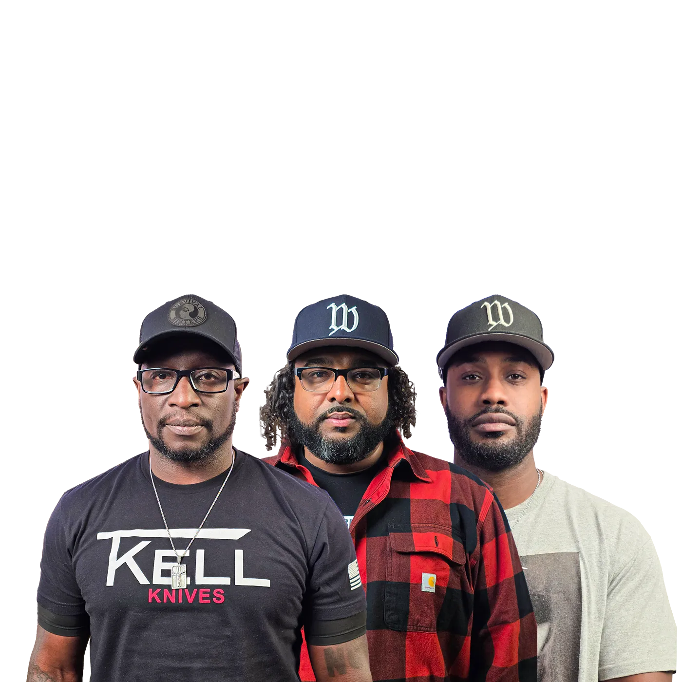
Show
We Da People Podcast
Hosts pictured
Shelton · Colin · Fred
File
wdp-podcast-hosts.png · 1400×1400 · PNG (transparent)
Transparent background. 1:1 square crop, safe for IG, flyers, and full-bleed posters. Need a different crop or resolution? Email partners@wedapeople.tv.
Do
- ✓Use on dark or light backgrounds — the PNG is transparent.
- ✓Credit "@wedapeopletv" on social when reposting.
- ✓Pair with the W mark or wordmark when context isn't obvious.
Don't
- ✕Don't crop faces, recolor, or apply filters that change skin tone.
- ✕Don't overlay text directly on top of the hosts.
- ✕Don't use to imply endorsement of products or events we haven't approved.
what we look like.
Generating a flyer, social post, or partner graphic with ChatGPT, Claude, Midjourney, Gemini, or any image tool? Paste the master prompt below to lock in the brand's visual DNA, then describe the specific piece you want. Pair it with the press photo and W mark from the sections above.
Master brand prompt
You are creating a graphic for We Da People Network — an independent 2A
media brand. Match the following visual system exactly.

BRAND
- Name: We Da People Network (sometimes "WDP Network")
- Tagline: Real talk. Real training. Real community.
- Voice: raw, unapologetic, plainspoken. Barbershop energy meets indie
  magazine. Black-American 2A culture, welcoming to new gun owners.
- Audience: 2A community, podcast listeners, gun owners and trainees,
  partner brands.

STYLE
- Editorial, raw, urban-tactical. Hand-rolled. High contrast.
- Sharp geometry. NEVER rounded corners. NEVER soft shadows.
- Hairline 1px borders in paper-on-black at 8% opacity.
- Subtle film grain is acceptable but never overdone — no heavy noise.
- Whitespace is part of the design. Don't fill every pixel.

COLOR (strict — do not introduce new colors)
- Background:  Ink         #0a0a0a   (default surface)
- Surface:     Smoke       #1a1a1a   (cards / panels)
- Secondary:   Ash         #2a2a2a   (borders / dividers)
- Body text:   Fog         #6b6b6b
- Headlines:   Paper       #fafafa
- Warm light:  Bone        #f1ede6   (optional editorial moments)
- Accent:      Accent      #b4131c   (deep matte red — for CTAs, highlights, eyebrows)
- Accent hot:  Accent-hot  #e11d20   (hover / active)
- No gradients. No neon. No pastels. No metallics.

TYPOGRAPHY
- Display headlines: Anton or Bebas Neue. UPPERCASE. Tight tracking.
  Tall and condensed. Line-height 0.92–1.0.
- Body / UI:         Inter, weight 400–600.
- Mono / metadata:   JetBrains Mono.
- Eyebrow labels: small caps, letter-spacing 0.18em, accent red color.
- Never use serif fonts.

LOGO — CRITICAL
- DO NOT draw the logo from a text description. Image models cannot
  reproduce the blackletter "W" reliably.
- If you are an image-generation model: leave a solid black placeholder
  rectangle where the logo should go (200×200px in a corner is typical).
  The user will composite the real PNG from https://wedapeople.tv/press/wdp-w-mark.png
  afterward.
- If you are a multimodal model that supports image editing: fetch
  https://wedapeople.tv/press/wdp-w-mark.png and place it as-is.
  Do not redraw, stylize, or recolor it.
- Primary mark: blackletter "W" — gothic, thick blade strokes — white on
  dark backgrounds, dark on light. NEVER red. NEVER stretched. Keep
  half-W of clear space on every side.
- Wordmark for the network reads "We Da People / Network" stacked.

COMPOSITION
- Big condensed headline. One CTA. Generous breathing room.
- 36×3px red accent rule used sparingly to stamp important sections.
- Eyebrow → red bar → headline is a common pattern.
- Square chips for badges (no pills): 10px bold uppercase tracked text.

VOICE ON THE ARTWORK
- Direct, punchy, conversational.
- YES: "Bullpup vs AR-15: which makes more sense?" / "Get at us." /
       "Real talk. Real training. Real community."
- NO:  "A Comprehensive Technical Analysis of Modular Rifle Platforms" /
       "Contact Us" / "Subscribe to our newsletter for important updates."

SUBJECTS (when including people)
- Hosts are three Black men: Shelton, Colin, Fred (see press photo).
- Don't crop faces or hats. Don't recolor skin tones. Don't apply
  filters that change skin or change the color of clothing logos.

AVOID
- Rounded corners. Soft shadows. Glow / neon. Gradients.
- Generic stock-photo styling. Faux-tactical clichés (camo background,
  hex grids, glowing chevrons, "operator" silhouettes).
- Serif fonts. Recoloring the W to red. Burying the lede in qualifiers.
- Politics imagery (flags, candidates, slogans). The brand is 2A
  culture, not a political ad.
Recipes — paste the master prompt, then add:
Event flyer
Create a 4:5 portrait event flyer for "{EVENT NAME}" on {DATE} at
{LOCATION}. Black ink background, large condensed uppercase headline
in white. Red accent bar above an eyebrow that reads "WE DA PEOPLE
PRESENTS". Place the WDP press photo (3 hosts) centered-lower, with
generous space above for the headline. Include a small mono detail
line at the bottom: date · location · ticket link. Subtle film grain.
No gradients. No rounded corners.
Episode promo
Create a 1:1 square episode promo for "We Da People Podcast — EP
{NUMBER}". Headline: "{EPISODE TITLE}" in big condensed uppercase
white text, left-aligned. Red badge in upper-left reads "EP {NUMBER}".
Below the headline, a one-line guest credit in Inter regular fog color.
Optional: small W mark in the lower-right corner. Ink background.
Hairline border at 8% paper opacity. No play-button overlay (this is
not a YouTube thumbnail).
Partner / sponsor post
Create a 1:1 partner announcement for "{PARTNER BRAND}". Eyebrow
small-caps reads "PROUD AFFILIATE" in accent red. Big condensed
headline: "{PARTNER}". Underneath, one-line value prop in Fog color.
Place the W mark and the partner's logo on the same horizontal axis,
separated by a slim vertical divider. Promo code in mono at the
bottom if provided. Ink background, sharp corners only.
Quote / pull-quote
Create a 1:1 quote card. Large condensed display headline (Anton-style)
that reads: "{QUOTE}". Quote text white on ink. Below the quote, a 36px
red accent bar followed by an attribution line in eyebrow small-caps:
"— {SPEAKER NAME}, WE DA PEOPLE PODCAST EP {NUMBER}". Subtle grain.
No portrait. No gradient. Generous margins — let the headline breathe. Critical — logo handling
Image generators can't reliably reproduce the W mark. Don't ask them to.
Even with a reference image, the blackletter detail comes out distorted. Use this 3-step workflow instead:
STEP 01
Reserve space
In your prompt, instruct: "Leave a solid black 200×200px placeholder rectangle in the lower-right for the logo. Do not draw any logo or symbol inside it."
STEP 02
Generate the artwork
Let the model render the background, headline, and any photo composition — without the logo. Review variants and pick one.
STEP 03
Composite the real PNG
Paste the generated image and the W mark PNG into the same chat: "Place this W mark in the lower-right rectangle." ChatGPT, Claude, Figma, Canva, or Photoshop all work.
Attach these alongside the prompt
- 01 wdp-podcast-hosts.png — the hosts (transparent background)
- 02 The W mark and wordmark from Downloads
- 03 The CSS token block from Downloads (gives the AI exact hex values)
Tips for better output
- ·Always specify the aspect ratio (1:1, 4:5, 16:9, 9:16). Tools default to square otherwise.
- ·Generate 3–4 variants per prompt, then pick — don't iterate on the same seed.
- ·For text-on-image, draft the headline in your prompt — don't let the model invent the copy. Image models still mangle long text.
- ·If a model keeps adding rounded corners or gradients, restate the AVOID block explicitly at the end.
The master brand assets live in the repo at
src/assets/brand/.
Right-click any of these to save. For partners or vendors, request a
production kit from partners@wedapeople.tv.
Logo & marks
- w-mark.png Primary W
- w-mark-outline.png Outline / embroidery
- wdp-network-wordmark.png Network wordmark
- wordmark-podcast.png Podcast wordmark
Tokens (copy-paste)
--color-ink:        #0a0a0a
--color-paper:      #fafafa
--color-bone:       #f1ede6
--color-smoke:      #1a1a1a
--color-ash:        #2a2a2a
--color-fog:        #6b6b6b
--color-accent:     #b4131c
--color-accent-hot: #e11d20

--font-display: "Anton"
--font-sans:    "Inter"
--font-mono:    "JetBrains Mono"
Questions about brand use?
Reach partners@wedapeople.tv.
Press kits, partner co-branding, merch templates, episode artwork — we keep a current production kit ready for affiliates and sponsors.